Once the wireframe felt solid, I moved into development using Xcode and SwiftUI. I chose SwiftUI because it fit well with my existing experience and made it easy to build quickly while seeing changes in real time. It also integrates smoothly with the Apple ecosystem, which was ideal since the app was designed for iOS.
At this stage, I focused entirely on the front end. Although I had considered adding a back end with features like login and data storage, I decided to prioritise the interface and overall experience. Given the time constraints and my goal to create a usable, testable prototype, it made more sense to refine the look, structure, and interaction first.
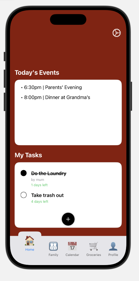
Navigation was built with NavigationView and NavigationLink, which kept transitions between screens like Home, Calendar, and Profile smooth and simple. One early challenge was SwiftUI’s default tab bar. It didn’t support emojis, which I was using as a key part of the app’s visual identity, so I built a custom one from scratch. That gave me more control over the design and allowed for things like animated text scaling and a background indicator that moves with the selected tab.
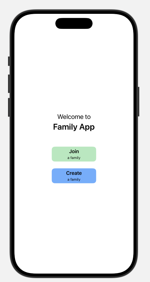
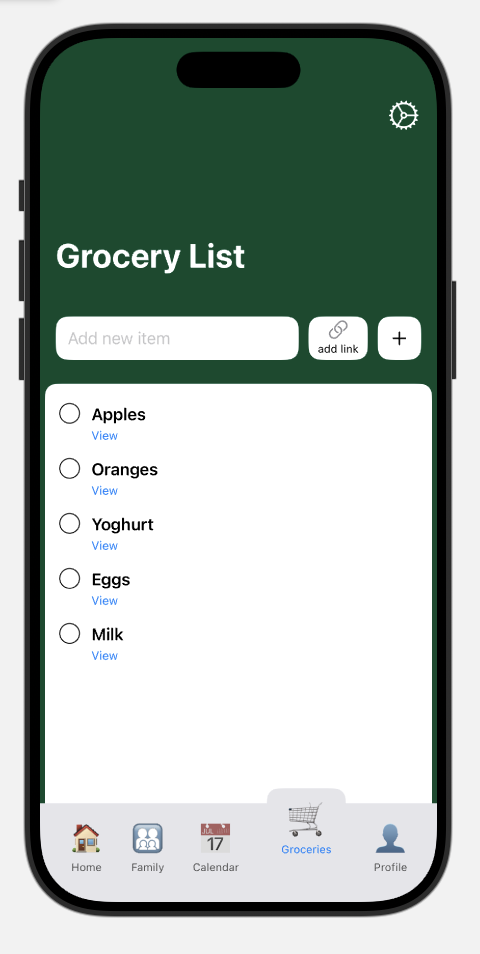
The app includes a few core screens. The landing page presents Join and Create Family options, currently visual, but designed with future functionality in mind. The Home screen features a Today’s Events panel and a personal task list. Tasks are displayed with a countdown (like “3 days left”) instead of a static date, which I implemented using Swift’s date handling tools. There’s also a shared grocery list where users can add items and even include clickable links, such as to a product online. I did run into a small issue where tapping a link would accidentally delete the item, but I resolved it by restructuring the layout to separate touch areas.
Leave a Reply