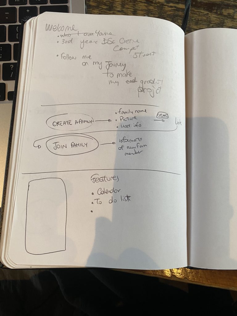
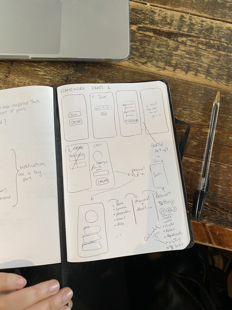
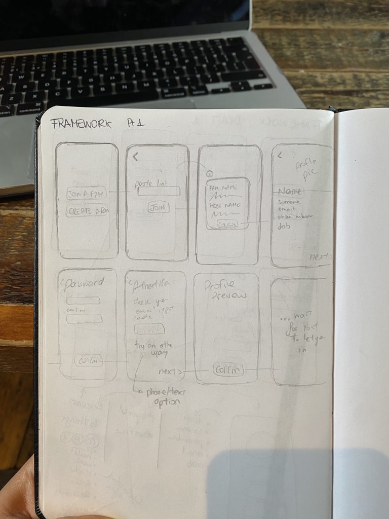
Before diving into digital design tools, I began the ideation process with pen and paper. This analogue approach allowed me to explore ideas quickly and intuitively, free from the constraints of software and layout precision. Sketching by hand enabled me to concentrate on core user flows, functionality, and overall experience rather than visual polish.
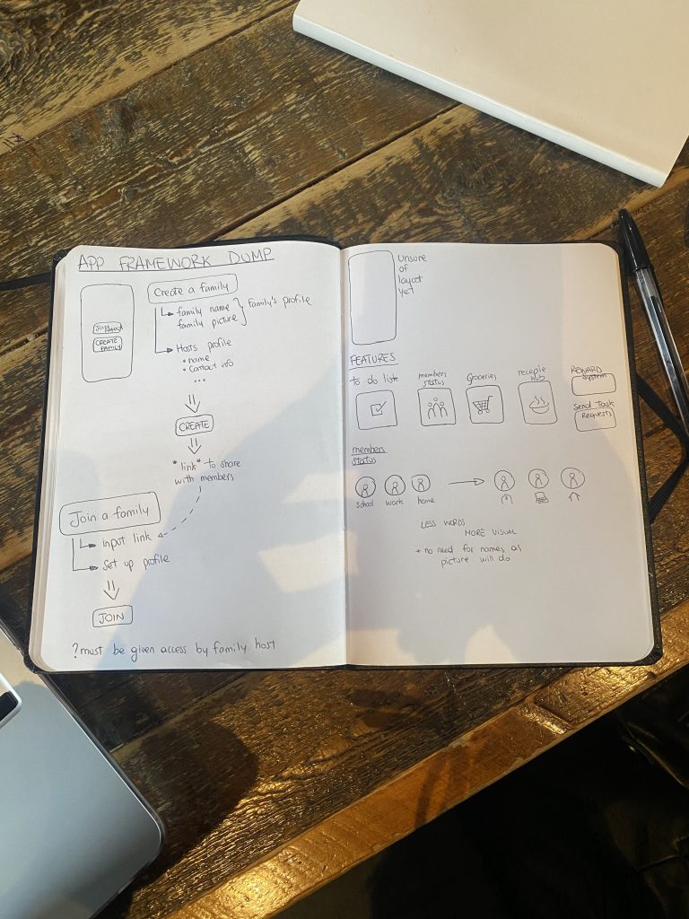
One of my early sketches outlined a typical onboarding process—how a user might create a family group, invite members, and set permissions. I considered key decisions upfront, such as who should approve new members and how roles might differ between users, for example, parents versus children, or hosts versus invited members.
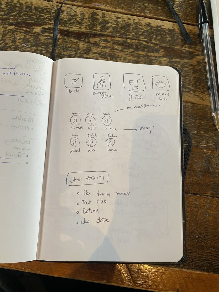
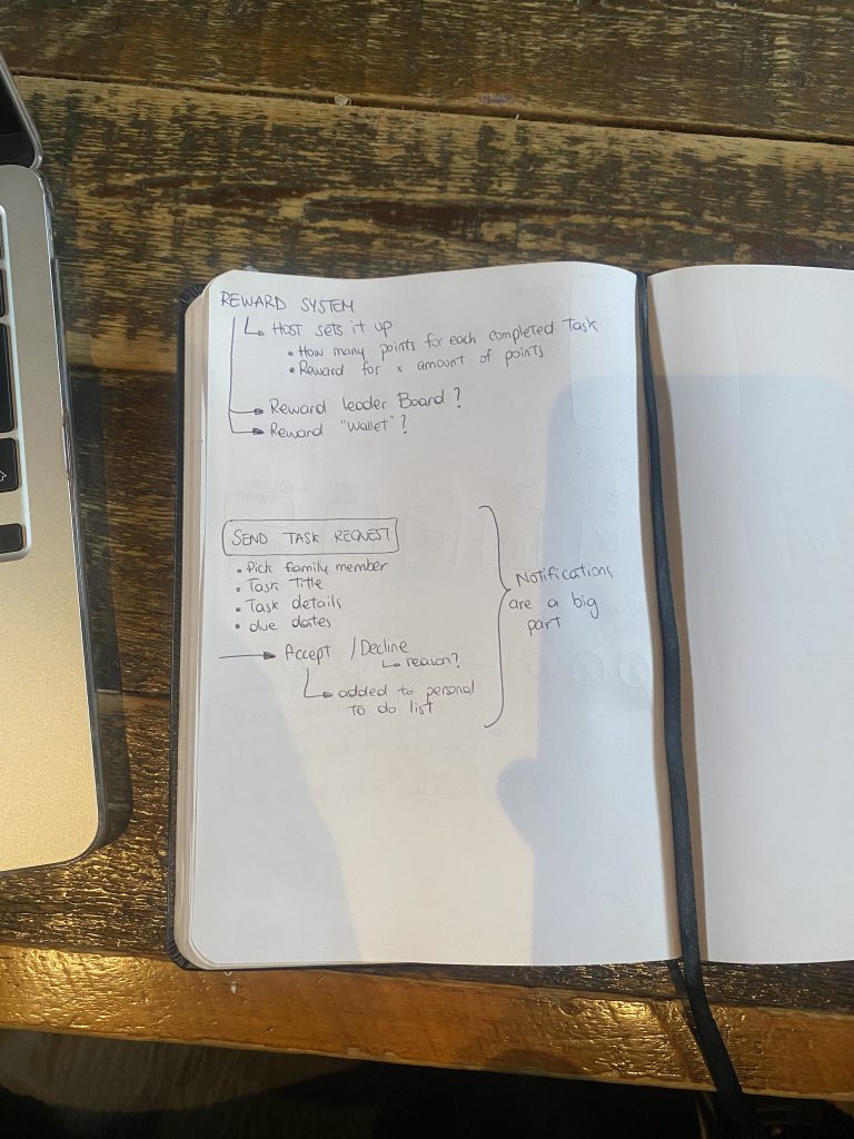
This initial phase proved essential in shaping the app’s structure. It helped me visualise the logical flow of key features such as shared calendars, to-do lists, and grocery management, ensuring that the user journey was grounded in genuine needs before any design system or UI layout was finalised. These early sketches served as a critical thinking tool, offering clarity on the app’s goals and guiding design decisions based on usability and experience—not just aesthetics.
In parallel with usability, I focused on emotional design. Families don’t just need structure—they need support and connection. To foster this, I incorporated small but meaningful features:
- A button to send a digital “hug” or “thank you”
- A shared journal space
- Status icons indicating if someone is at work, school, or resting
These elements were inspired by research showing how small gestures can strengthen bonds, particularly between fathers and children. My hope is that these features help the app feel more like home and less like a spreadsheet.
Leave a Reply