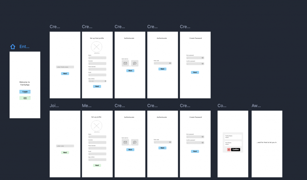
Following the initial paper sketches, I created a digital wireframe using Mockplus. This platform was chosen for its intuitive drag-and-drop interface, which enabled rapid iteration and helped translate early concepts into a coherent user flow.
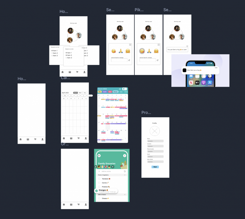
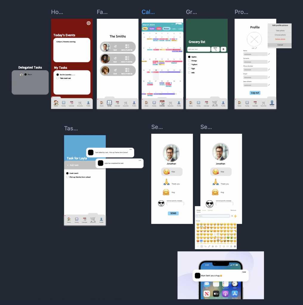
The design process focused on functionality, accessibility, and clarity. The onboarding experience was simplified, offering users two entry points: Create a Family or Join a Family using a unique code. Once inside the app, users were presented with a structured home screen featuring:
- Shared calendars with integrated travel time indicators
- Task lists with request and approval workflows
- Collaborative grocery lists that support images and external links
- Gentle notifications and nudges to encourage ongoing participation
- A simplified onboarding flow using short, easy-to-use join codes
Design decisions were shaped by prior research into intergenerational technology use. Layouts prioritised usability with large buttons, icon-heavy navigation, and minimal reliance on text—supporting both tech-savvy teens and older adults. Visual elements such as avatars, emojis, and soft colour coding were introduced to enhance engagement and warmth.
Some initially considered features, such as gamification and reward systems, were deliberately postponed due to their complexity. Wireframing made it easier to identify which elements were essential and which could be deferred without compromising the user experience.
This stage played a critical role in establishing a solid, user-centred foundation before development began.
Leave a Reply